The Poetry Edition
In house:
Design Lead and Art Direction: Lily Fulop
Creative Director: Vanessa Witter
Copywriter: Katie Bravo
Contributing Artists: Sarah Dewlin, Gretchen Schwartz, Lori Goldman, Samantha Wang, and Vanessa Morrish
Photoshoot:
Creative Production Studio: Breakfast for Dinner
Photography and Styling: Alex Wallbaum and Evan Sheehan
Producers: Jonathon Spagat and Morgan Yi
Set Fabrication: Angela Finney and Josh Zeuske
Hair and Makeup: Enez Beauty
Wardrobe Stylist: @an.ika
Who Gives A Crap
2024
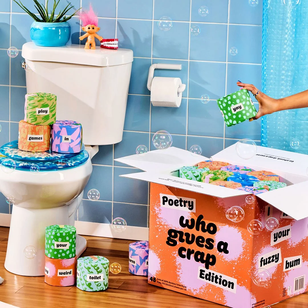
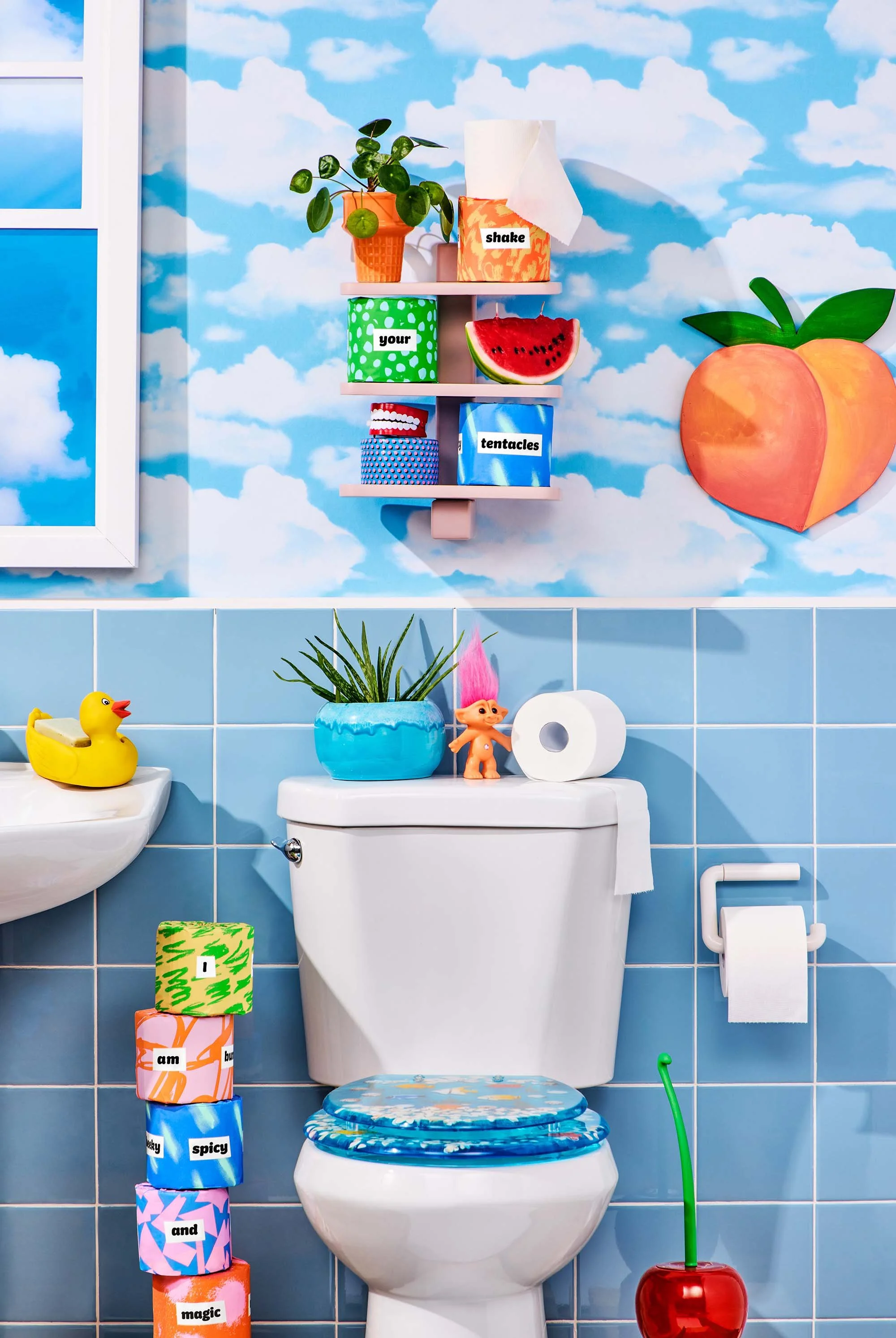
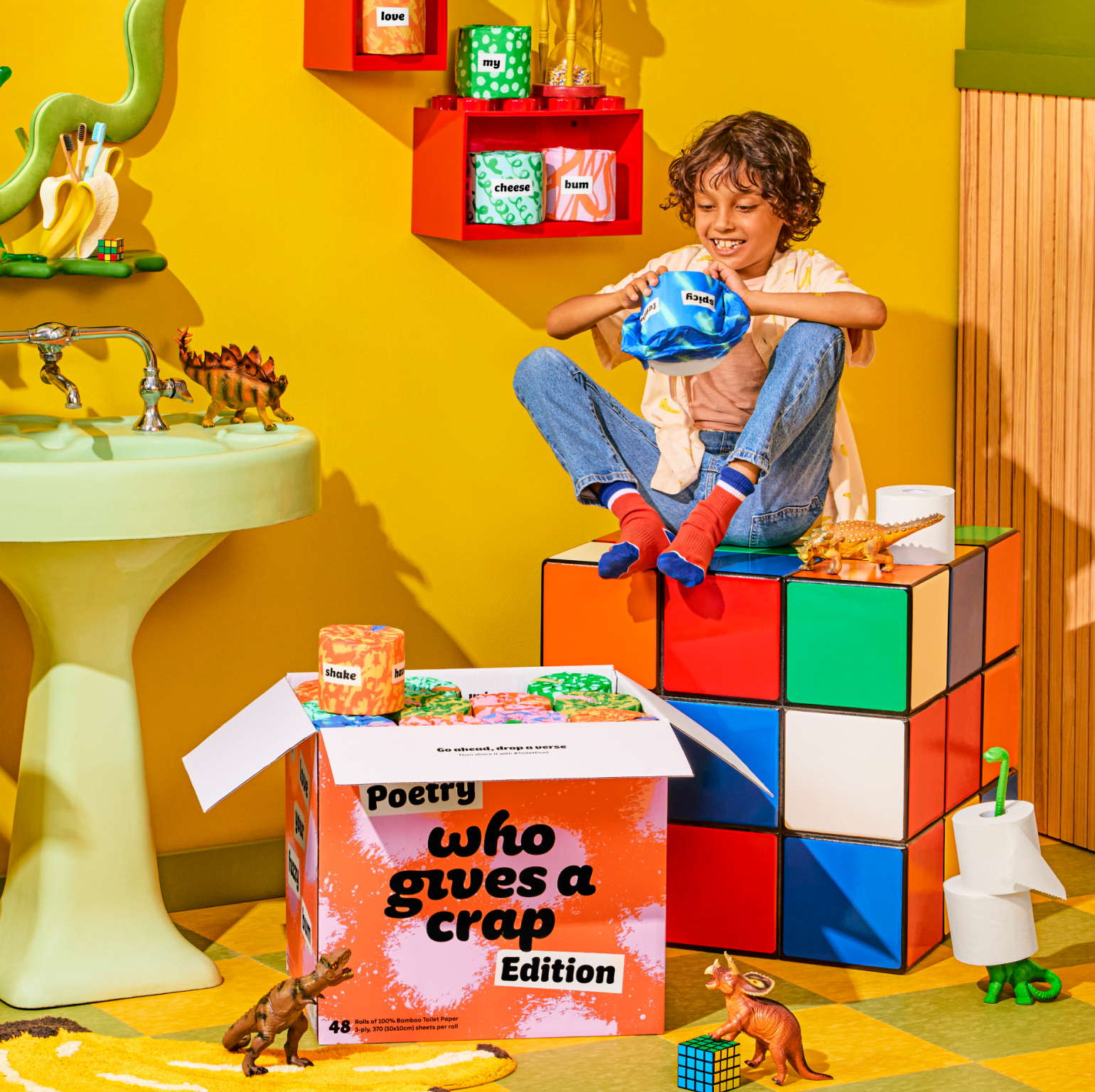
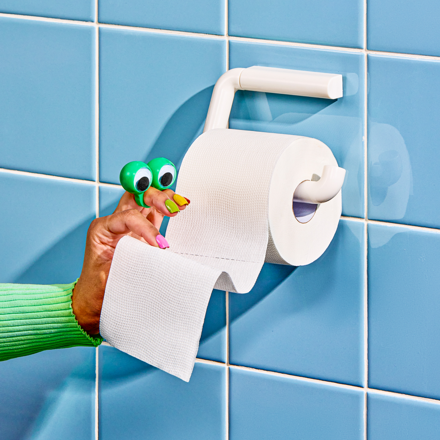
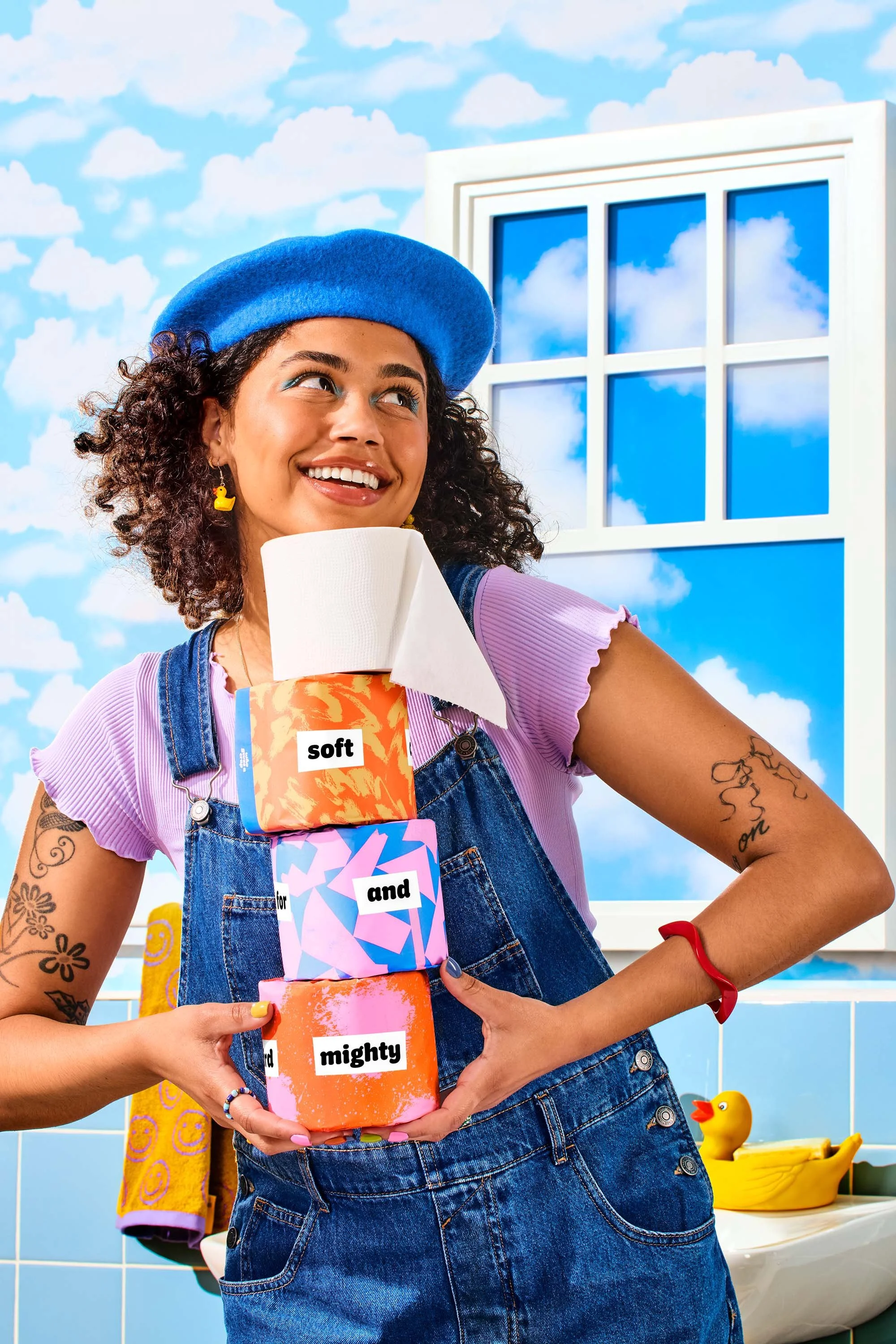
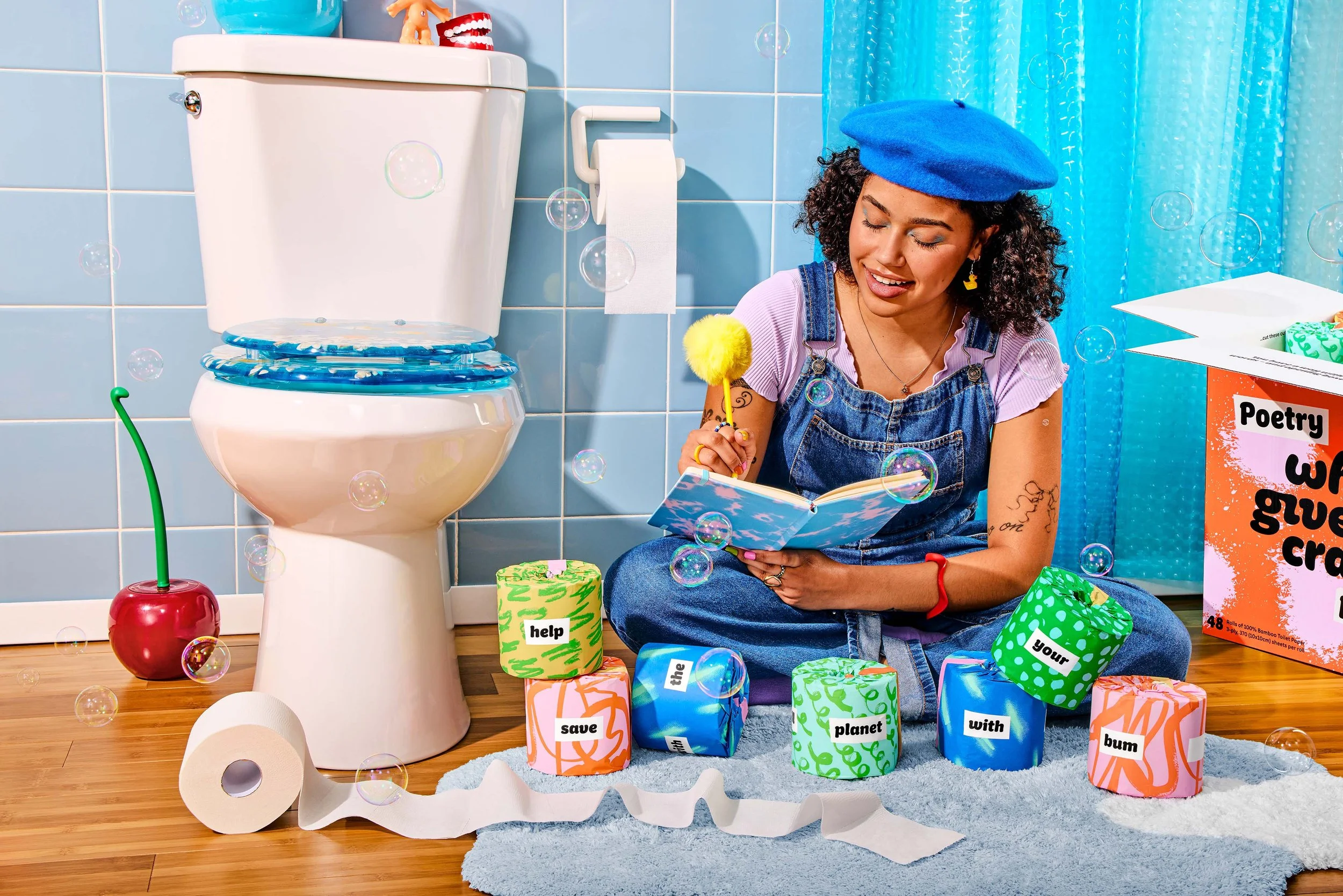
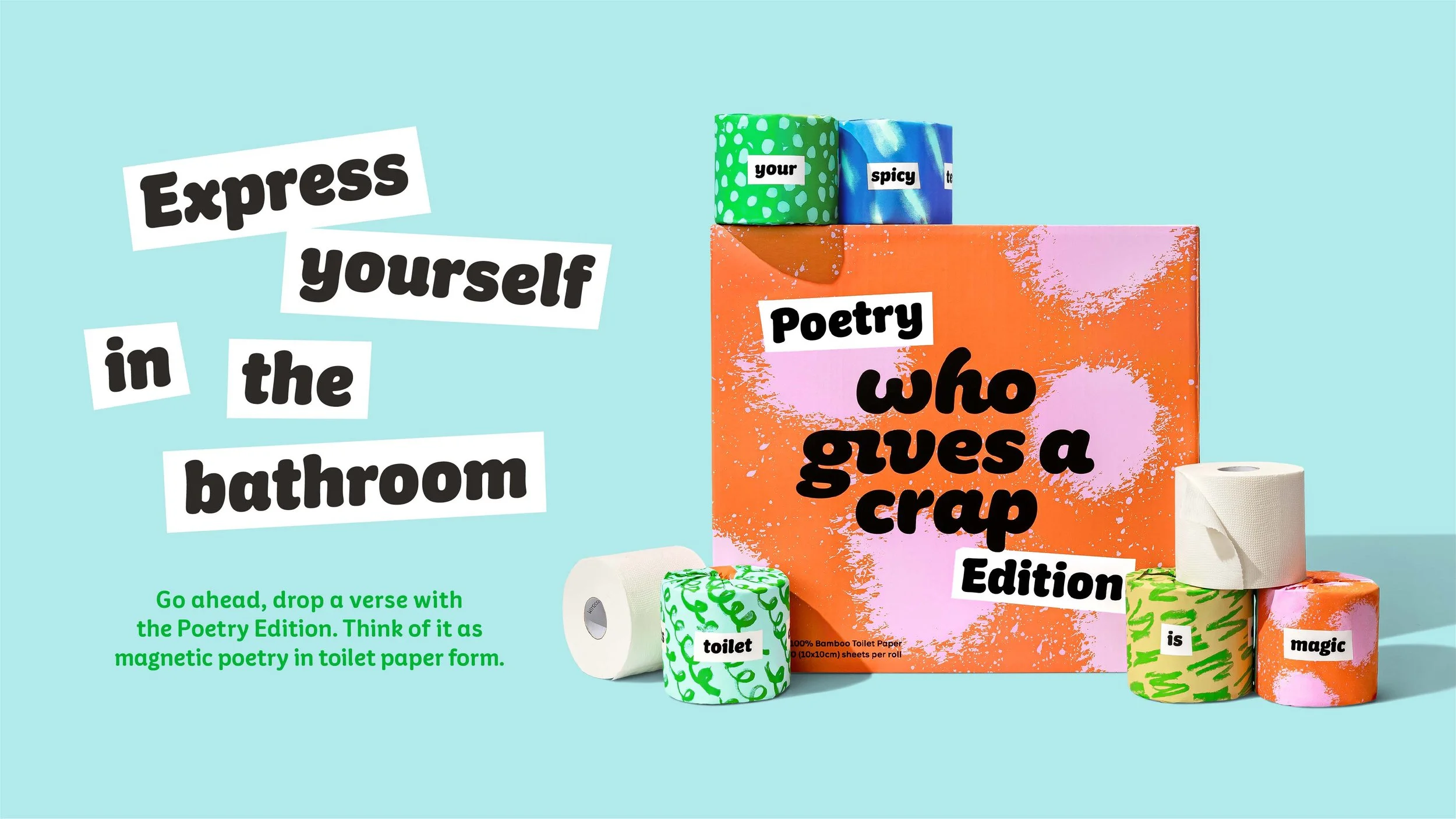
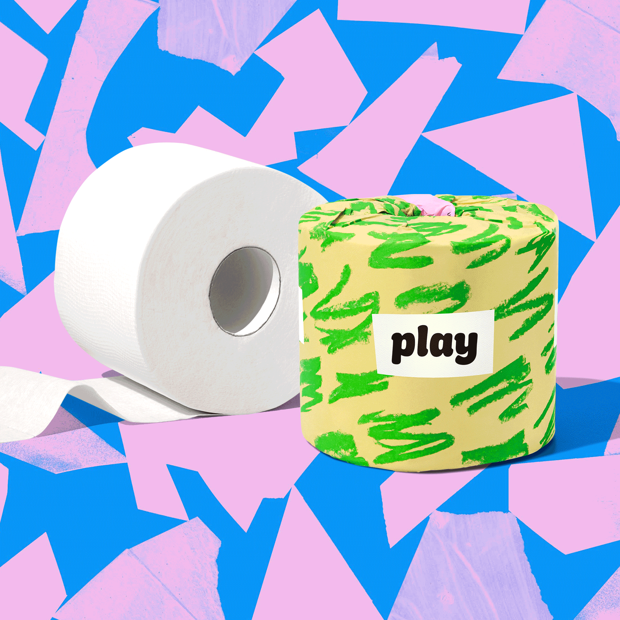
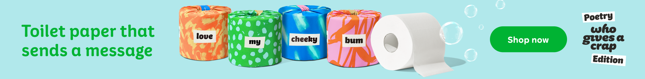
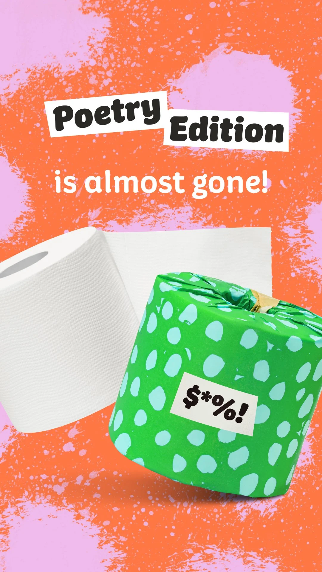
Who Gives a Crap is a sustainable toilet paper subscription brand that features yearly themed limited editions. The toilet paper is plastic free, so it comes in paper wrappers which are perfect for customizing with fun art that can be displayed in your bathroom! This limited edition was inspired by magnetic fridge poetry. The goal was to create packaging that felt highly expressive and creative, to inspire customers to play with the rolls to create poetry!
I designed the packaging using abstract patterns that had a textured touch for an authentic feel. For the patterns, I asked our internal team to contribute mark making explorations using analogue tools, seeking inspiration from emotions and songs. Then, I digitized their work into unique repeat patterns that would feel human and expressive. I utilized a bright color palette to match the playful and fun nature of the words on the rolls.
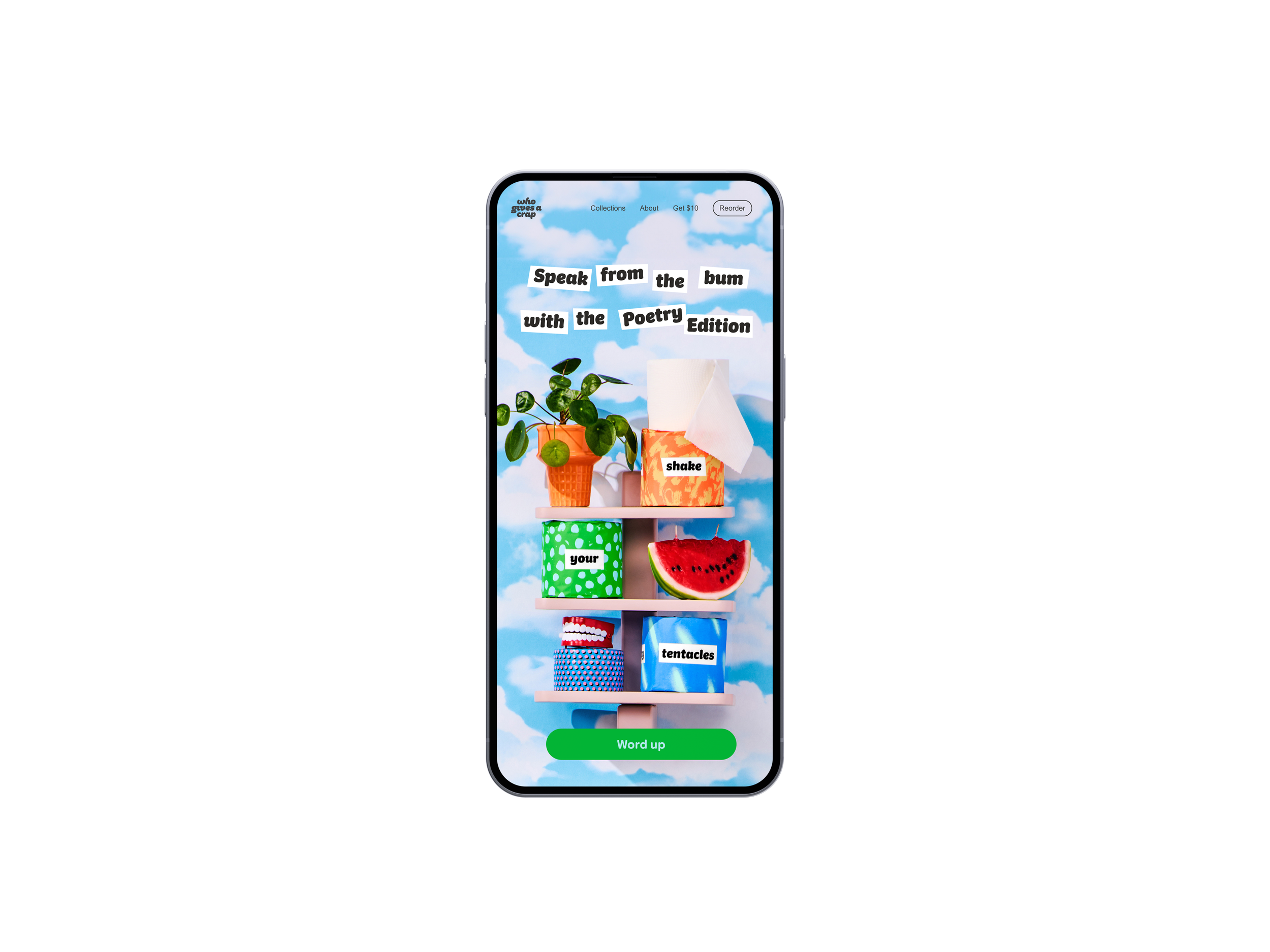
The campaign highlighted the funny, weird, and sometimes profound phrases and poems that you can create using the rolls. The supporting photography featured imaginative sets and playful styling to visualize the creativity of the edition. Read more about the production of the shoot below!


Photography
Art Direction
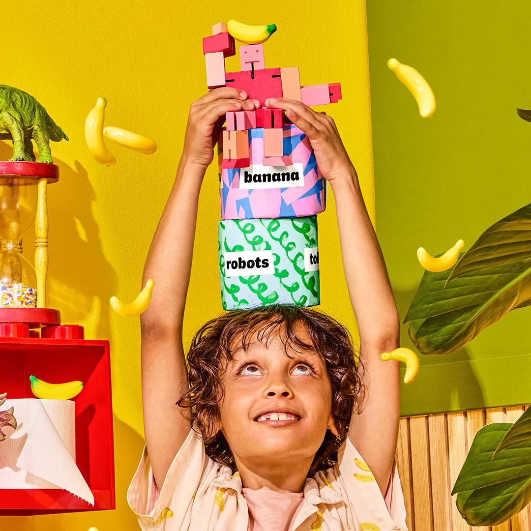
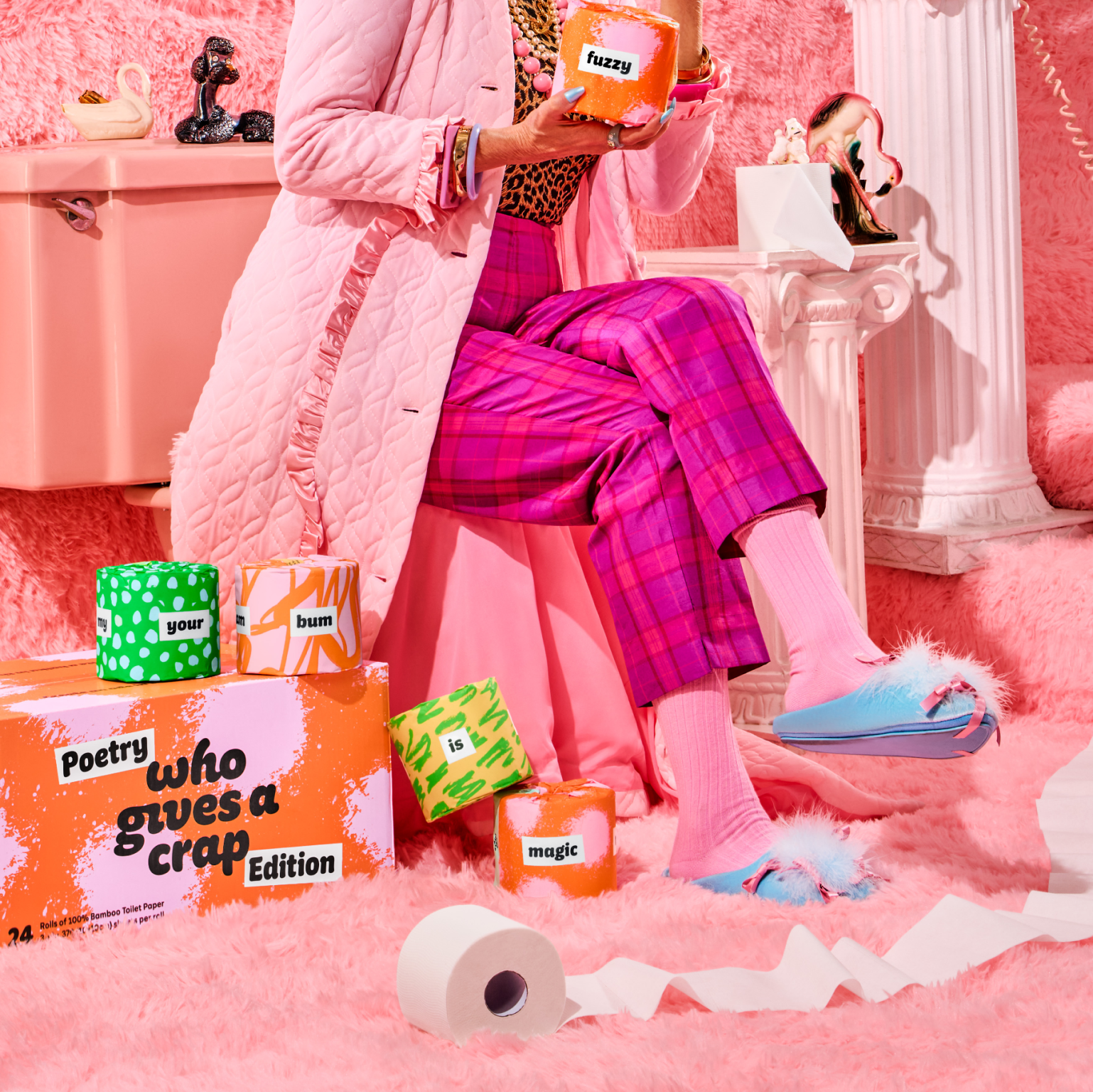
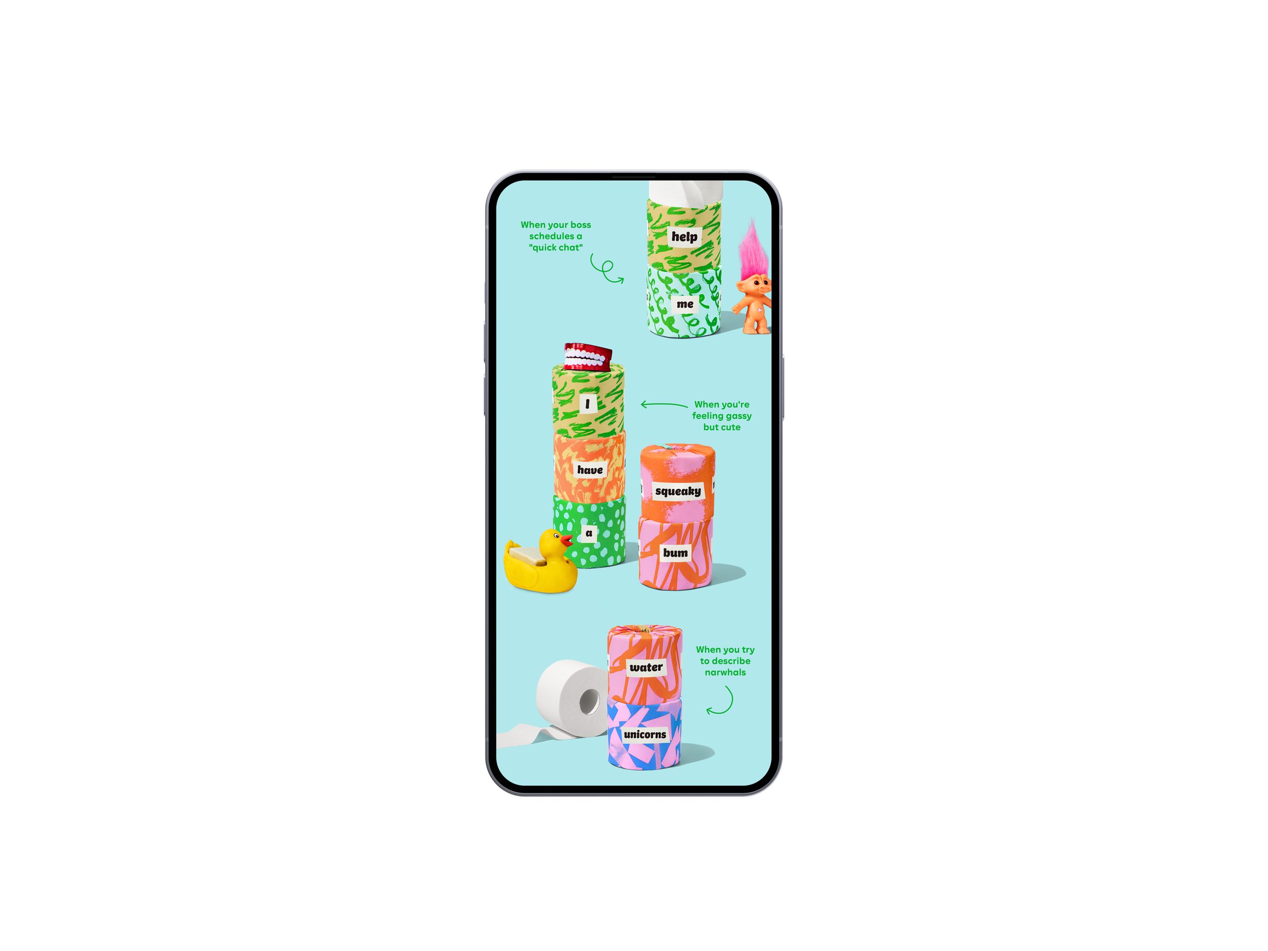
I developed three unique personas and bathroom worlds to show how the rolls can spark imagination in many forms! We wanted to convey that this toilet paper is fun for kids and adults alike, and while there is a limited number of words to play with, the possibilities will feel endless!
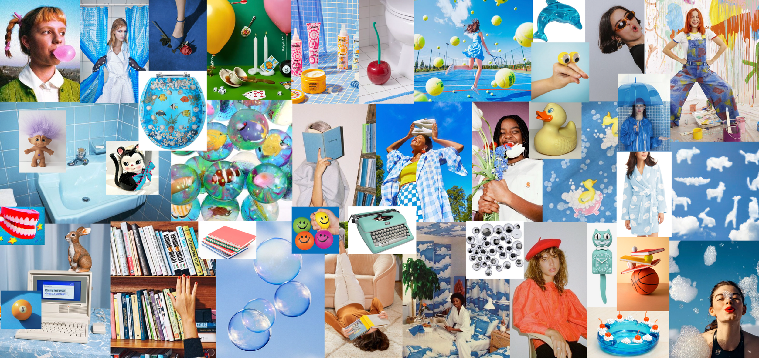
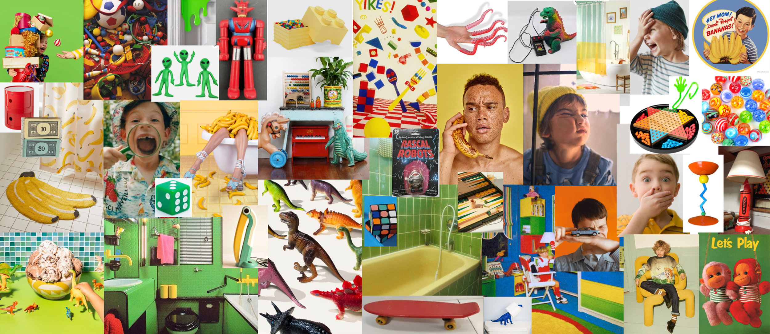
The aim of these mood boards was to inspire our set designers and stylist without being prescriptive or derivative, which is why I included a lot of non-literal references to create a certain “vibe.” The approach was all about creativity—using our own creativity, and producing images that would embody the creativity you’ll feel when you’re making poems with this toilet paper.
“Squeaky Bubbles”
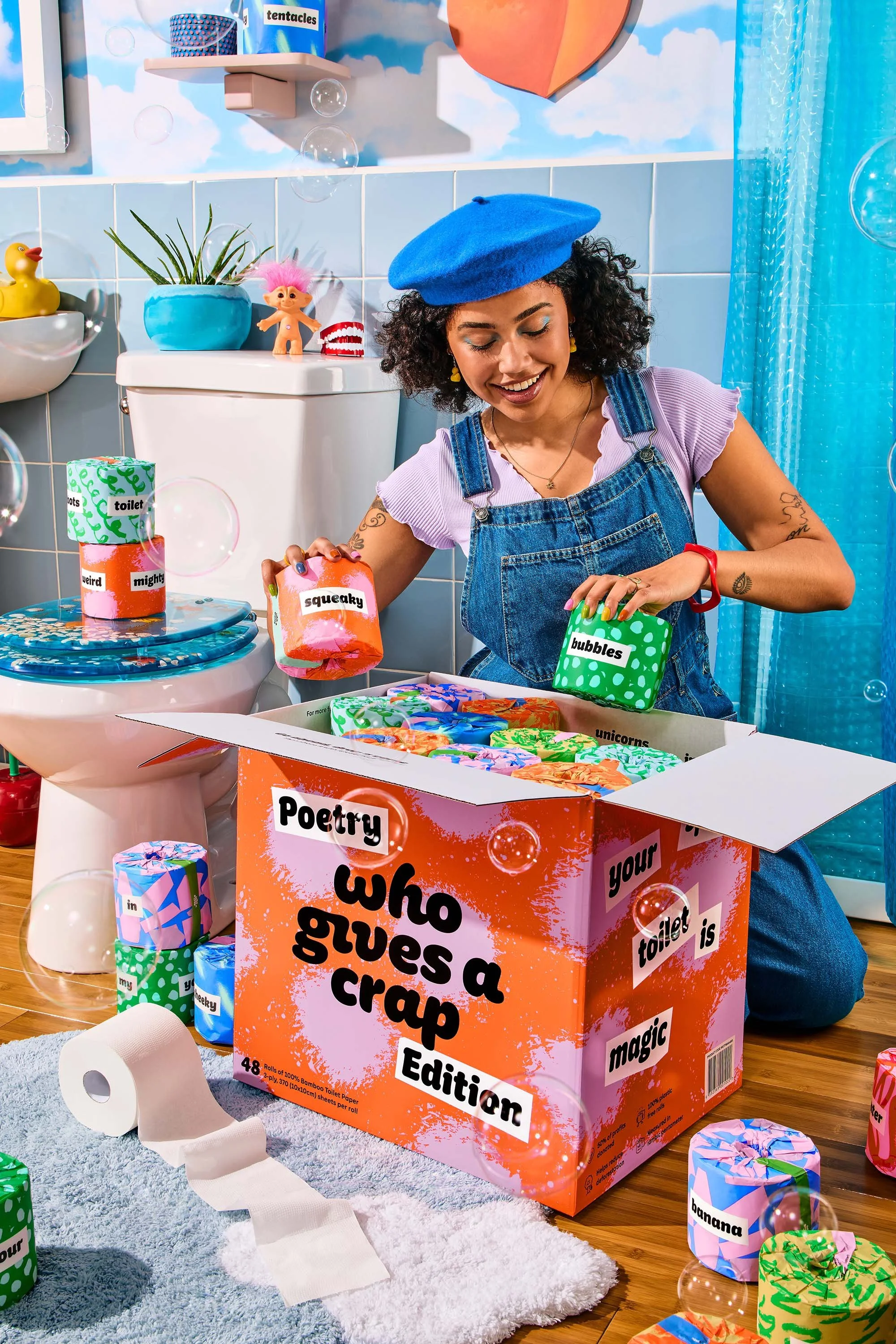
The hero persona for the shoot was the “playful poet” in a bathroom inspired by the rolls featuring the words “squeaky” and “bubbles”
“Fuzzy Unicorn”

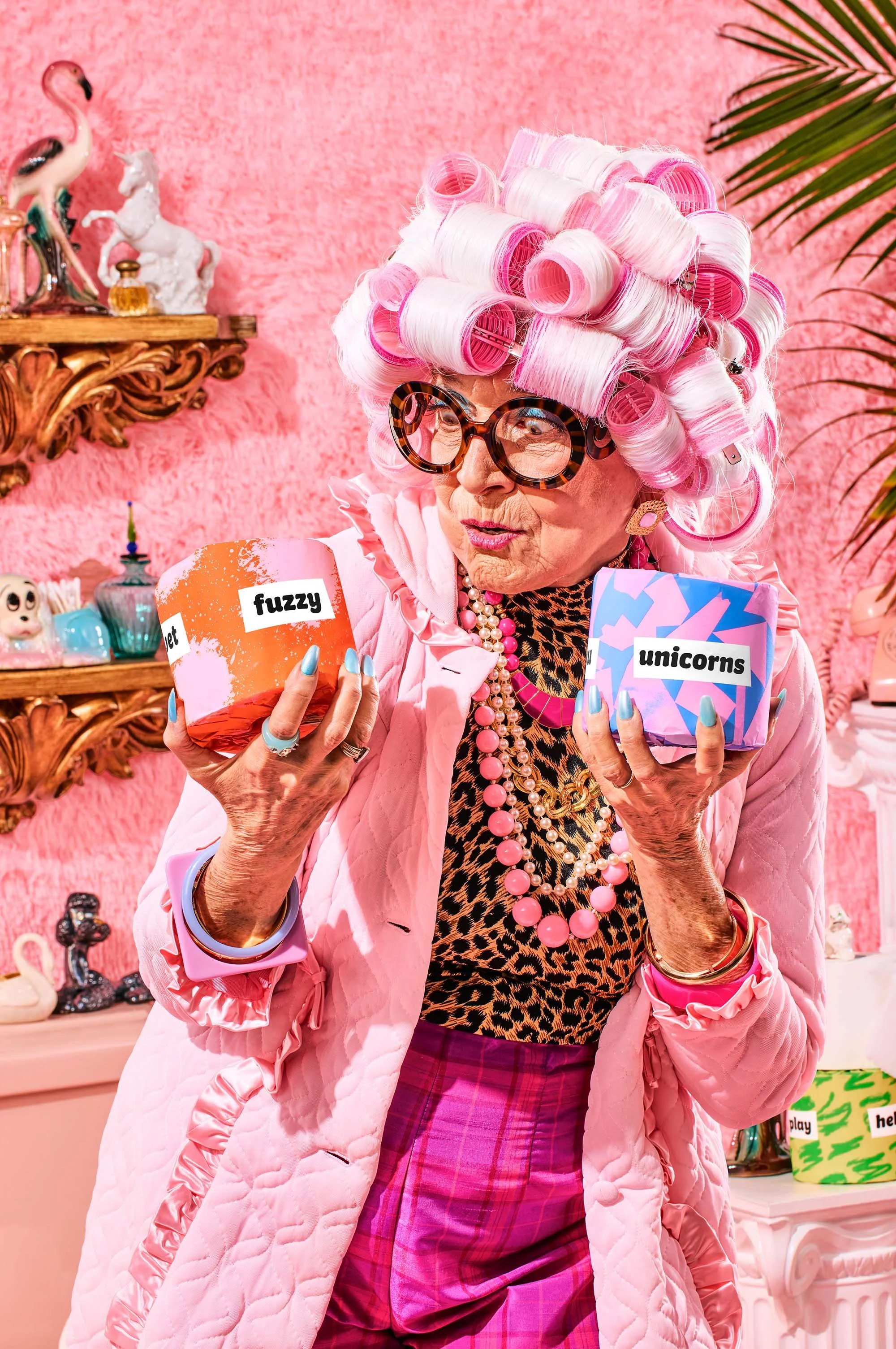
This persona was inspired by the words “fuzzy” and “unicorn.” She loves the finer things in life… and carpeted bathrooms.
“Banana Robots”
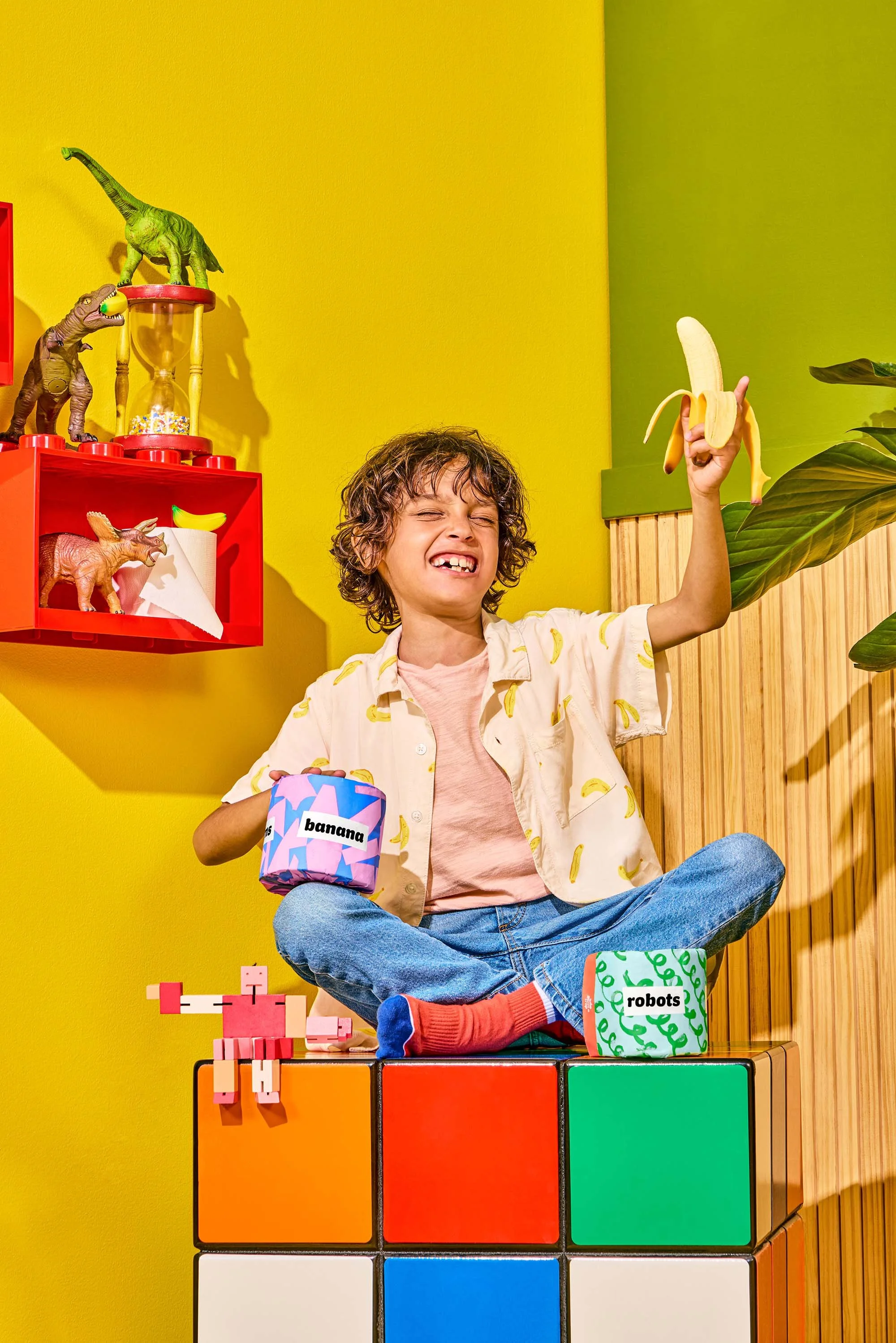
The final persona was a kid who loves “bananas,” “robots,” and playing funny games. He’s most likely to use the rolls to play a prank.